01 BLUF
The Bottom Line:
- Made UX a practice area within Procore, leading to better experience for customers.
- Integrated Procore branding into overall UI elements better.
- Deep dive UX and visual design for two major modules: change management and submittals.
02 Our Role
UX, Visual Design, Training, Team Building
03 The Details
An invitation
Sam Crigman, Procore's Head of Engineering (current CTO), approached John after his talk at RailsConf in Chicago about Developers and Designers working better together. He was invited to Procore's Carpenteria (near Santa Barbara), California headquarters, to present the talk to their engineering and product team and then lead a day of hands-on workshops teaching UX discovery techniques.
That two-day event led to an ongoing engagement with the company in which we achieved a series of outcomes:
- We prioritized user experience as a practice with management;
- We helped build out a UX team;
- We collaborated & devised a new brand-based look and feel for the app framework; and
- We built a full suite of prototypes/mocks for two of their best-in-class construction management software modules.
The Problem
After John's initial help training the team on implementing UX analysis in their everyday work, the company approached me to help them reimagine some product modules, starting with Change Management. The application had a UI heavily derivative of Basecamp at the time, there were not many well-established patterns for interaction, and there was no brand cohesion.
Change Management Module
The first module we tackled was Change Management. This module involved working through and identifying the complex flows that might occur while working on a project. Some of these would also invoke other issues around non-reimbursement, so it was critical to capture this in full detail.
These screens were worked out in sketch wireframe and then created as high-fidelity mockups in Photoshop for implementation direction.
We initially used the old navigation paradigm, but it became clear that this was untenable for the future platform direction.
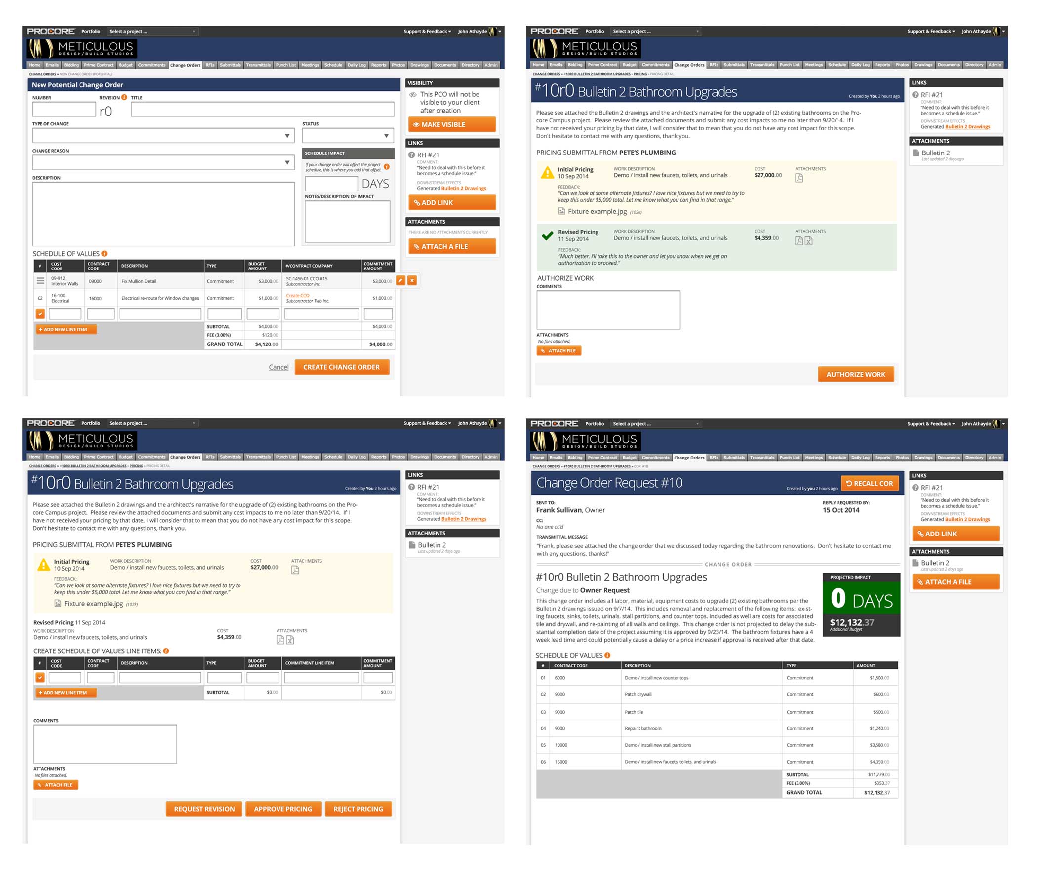
Various screens of the change management flow for owners an contractors.
A New Navigation
We pulled in the brand design team to determine how we could bring the Procore brand's look and feel (warm colors with a primary orange) into the product. We explored a series of navigation ideas and tried ideas from various staff designers.
This overall frame had to solve for multiple states on over a dozen modules. We used virtual card sorting to collect these into logical groups and then determined how those groups and child items would surface based on the user's role in the system.
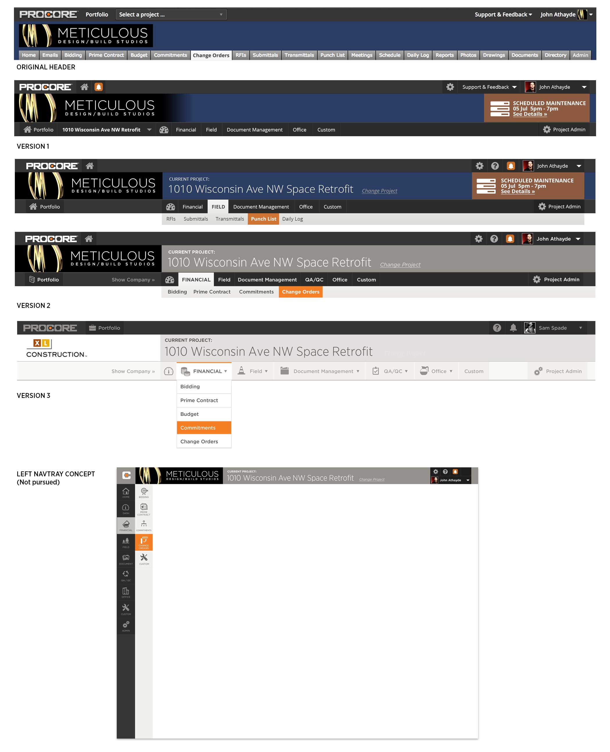
Evolution of grouped navigation, including a nav tray option that was not pursued. Future mockups leveraged the third version.
The Screen That Sold UX
Initial work on the first module was proceeding well when Brandon Terry (VP of Product) asked us to present with him to the executive team about a future for UX at Procore. We showed various slides discussing details but ended with this mockup/vision board that put a flag in the ground and set Procore on the path to its modern UX team and look/feel.
We used one of the more complex screens from Change Management and updated the navigation with the new elements for the pitch.
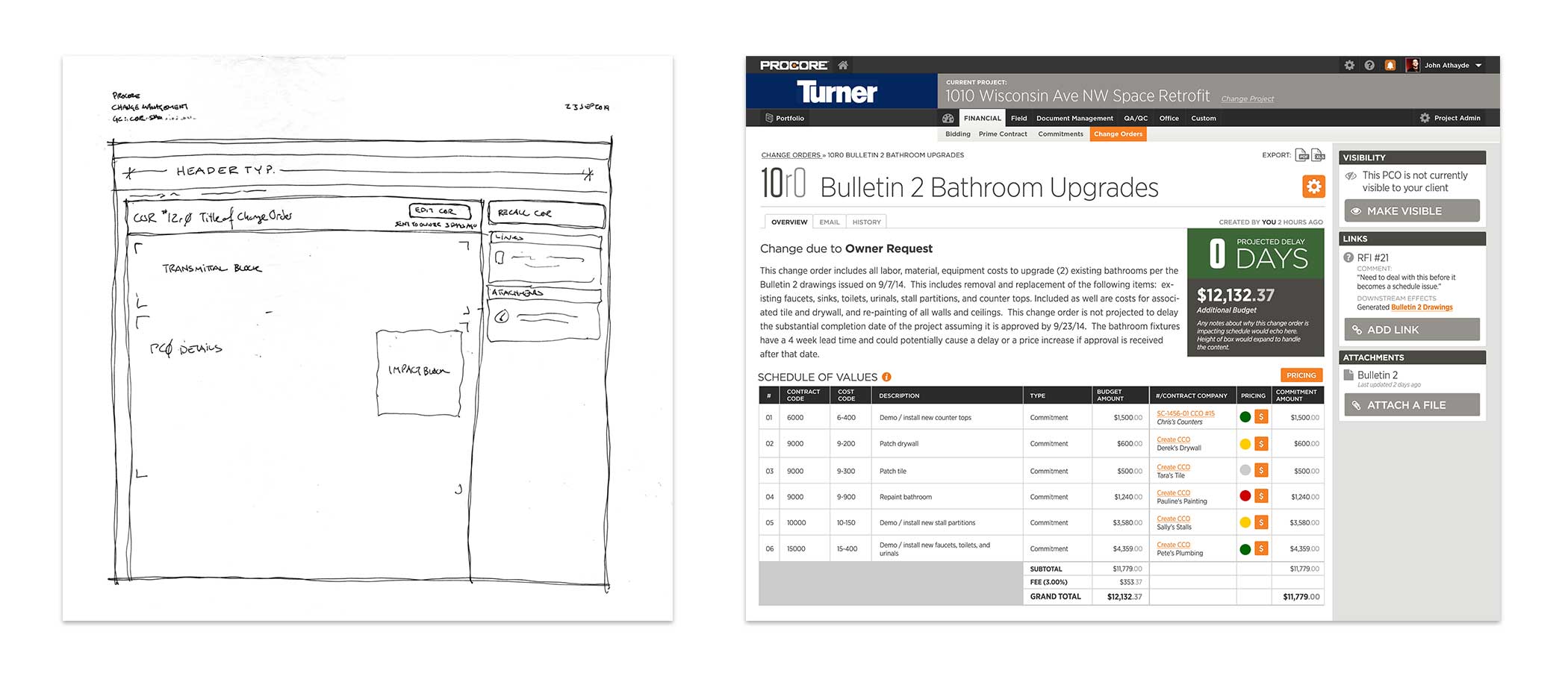
Wireframe and mockup of the presentation screen
Submittals Module
Submittals were traditionally extensive collections of paper files stored in the architect's office in dozens of binders. The prime and sub-contractors involved in the project also maintain copies, creating a massive amount of paper waste and also a difficulty maintaining a single source of truth for the project.
The module redesign we created with Josh Newland (product manager) built on the previous financials module work and allows for very complex, role-based workflow creation and modification.

Key screens from the Submittals module.
A Better First-Time Experience
People often imagine dashboards as completed items with all the data, but our first experiences with them are as empty canvases waiting for action. Without direction, these can become blockers for many users. We took a look at how we could improve the first-time experience and provide some non-blocking training to the users of Procore's Submittals module.
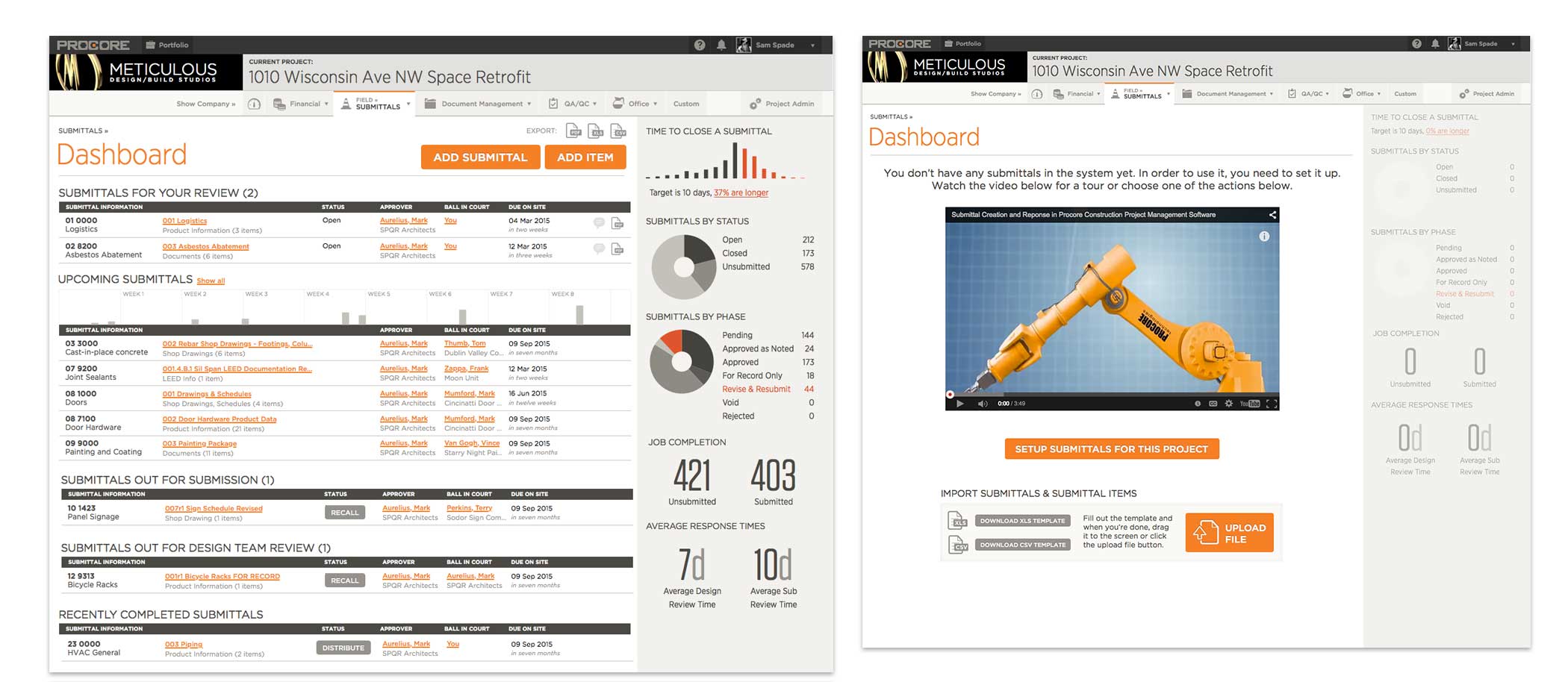
Full dashboard with data (L) and equivalent dashboard when first loaded (R)
Getting it all clear
The module ended up having over 80 different screens and states mocked up to walk end users through in a prototype. These screens included document review/approvals and management of the submittal for the architect, contractor, and sub-contractors.
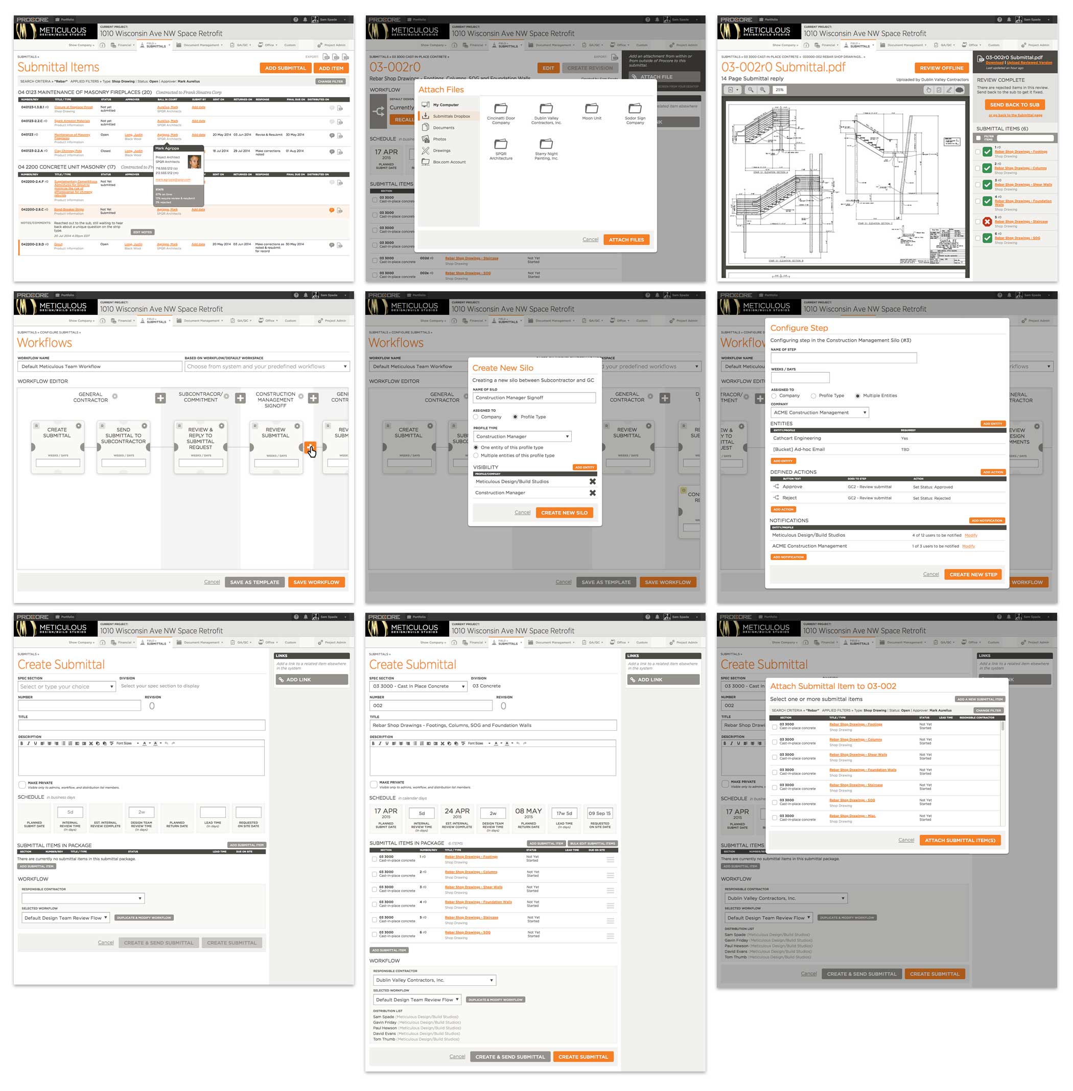
Overview of various screens from the Submittals module.
- We helped hire two senior UX designers, handed off the strategy work to the new head of Design (Raf), and helped establish UX as a primary function in the organization.
- After almost 18 months of collaboration, we rolled off the project.
- Procore was the first Architecture/Engineering/Construction (AEC) space Unicorn (a valuation of over 1B USD) and went public in 2021.
04 Testimonial

I have nothing but positive things to say about working with John and his design consultancy, Meticulous. John worked with Procore for roughly a year in varying capacities - first as a UX thought leader, teaching our organization about user experience design, then second as a consultant/contractor doing design work for strategic projects.
As a thought leader in UX, John helped transition our organization from being one that had limited understanding of UX design as a discipline, to one that now has a UX team of 15, with dedicated UX designers in every scrum team, thus treating UX as a primary function. That organizational shift would not have been possible without John's leadership, depth of knowledge about UX, and willingness to work with our organization on our specific needs.
As a designer, John was nothing less than astounding. John led and participated in product discovery and usability calls to craft designs for some of our most strategic projects. His work was progressive and inspiring, working with existing paradigms where need be and striving to improving paradigms where he thought it was needed. He coached other designers on our team and developed their skills, teaching us all quite a bit about design along the way.
—Brandon Terry, Procore VP Product, Nov 2015